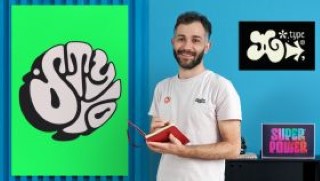
70s-Inspired Lettering Design
Experiment with wavy lines, exaggerated proportions, and bold contrasts to create groovy letters inspired by the 70s
The antiwar protests and artistic exploration that took place in the 1970s gave way to experimental shapes that defined the decade. As a designer and lettering artist, Santiago Arango is fascinated by how a period and its context can influence letter styles. Ready to join him for a trip back in time to explore this artistic movement?
In this online course, learn the fundamentals of typography to create 70s-style letters. Study silhouettes, examine compositions, and experiment with wavy lines, exaggerated proportions, and bold contrasts to make a groovy lettering design.
Begin the course by getting to know Santiago Arango, who tells you a bit about himself and his professional career in type design. He also shares some of his most distinguished projects and the designers that have inspired him on multiple levels.
Discover how letters are formed and where their shapes and silhouettes come from, before learning some tricks for creating more balanced and professional-looking sketches. Then, analyze how social and political contexts can influence lettering styles.
Once you understand the basics, try your hand at drawing different letters, playing with serifs, ligatures, and compositions. Continue to experiment until you find an idea you like and digitize it using your cellphone camera or a scanner.
Santiago teaches you some simple yet fundamental techniques to vectorize your sketch and transform it into a clean, high-quality design. To wrap up, apply some effects to your letters to give them an extra groovy feel, then prepare your files for production and create a mock-up with your final artwork.
User Reviews
Be the first to review “70s-Inspired Lettering Design”
You must be logged in to post a review.


There are no reviews yet.