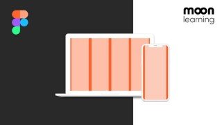
Responsive Design with Grids. A Guide for UX/UI Designer
Learn everything about using grids for UI design in this comprehensive course. From basic setup to responsive design, breakpoints, and more. Perfect for UX/UI designers and front-end developers. Switch from Sketch or XD to Figma with ease.
What you’ll learn
- Everything about Responsive Grids from 0 to hero
- Setting up Adaptive, Responsive and CSS Grids in FIGMA and adding content the right way
- Basic setup like Columns, Grutter, Margin, and Rows
- Adding content to the grid, avoiding common positioning mistakes
- Understand the difference between responsive and adaptive behaviour
- How Grids make your design responsive
- Understand what breakpoints are, where they come from and how to use them
- As a final project, we will be building our own responsive portfolio in Figma
- Classic Grid Systems such as Bootstrap Grids and CSS Grid
- go the extra mile and look at some basic code, all set up for UX/UI Designers to really understand the technicality behind the product you are building.
In this class, you’ll learn everything about using grids for your UI Design.
Grids are not only your best friend when it comes to creating a consistent layout. They are also the backbone when it comes to responsive design and making your product shine across all screen sizes.
We will start from zero and make sure you will be a pro by covering the following subjects:
We will learn about the basic setup like Columns, Grutter, Margin, and Rows
We will learn how to add content to the grid
We will make sure to avoid common positioning mistakes
Then we will have an intensive look at how Grids make your design responsive
And how you, as a UX/UI Designer, set up your designs in Figma accordingly
We will get into the details of how breakpoints work, where we can find them, and why they are such strange numbers
We will learn about the difference between responsive and adaptive behaviour
As a final project, we will be building our own responsive portfolio in Figma
Besides the classic Grids like Bootstrap and co, I will tell you a bit about my favourite grid, the CSS Grid, full of possibilities.
And yes, we will go the extra mile and look at some basic code, all set up for UX/UI Designers to really understand the technicality behind the product you are building.
The Figma and code templates I will show you are part of the course material to ensure you can dive right into the making.
NOTE: This is a course for UI Designers and not programmers! We will work with some basic HTML and CSS to understand how the grid works, but this is designed for a better understanding for UI Design in Figma.
Who this course is for:
- Beginner and Advanced UX/UI Designer
- Graphic Designer switching over to UX/UI Design
- Front-End Developer wanting to improve their communication with the design team
- Anyone interested in learning about Grids in UX/UI Design
- Sketch or XD users switching over to Figma
User Reviews
Be the first to review “Responsive Design with Grids. A Guide for UX/UI Designer”
You must be logged in to post a review.


There are no reviews yet.