HR Analytics – Build Dynamic Excel Dashboard from Scratch
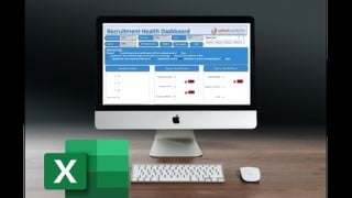
Learn how to create a professional KPI dashboard in Excel and impress your manager with interactive, dynamic reports. This course teaches you effective design principles and provides a step-by-step approach to building dashboards for any business problem. Take your Excel skills to the next level and elevate your reporting abilities.
What you’ll learn
- Learn how to create a professional KPI dashboard from scratch
- Build Interactive Dashboard Reports with Buttons and Drop Down Menus
- Streamline and Analyze Data with Excel PivotTables and Linked Charts
- The Art of creating Visually Stunning Excel Dashboards
- You can write some macros and design KPI Dashboard.
- Use effective design principles when creating and presenting data
- Effectively summarize and present data clearly
- How to approach an Excel dashboard project from idea to delivery
- Impress management with reports that make the decision-making process faster
Well, we’re going to build an interactive dynamic dashboard in excel. Yes you heard it right. We gonna create it in MS Excel. No, we are not kidding…. Let me show you the end result, then you might believe me. You may have seen dashboards in tableau, power BI. but it’s time you learn how to do that in excel.
Why excel?
My reason for building it in MS excel is because excel is easily available to everyone, and almost everyone have hands-on experience in working in Excel.
Additionally let me tell you one very amazing part. You gonna learn to create the dashboard in less than two hours. Yes you heard it right, in less than 2 hours Amazing isn’t it. Just imagine, your manager asked you to submit the report, and comeback with and interactive, dynamic, analytical dashboard. Definitely, It is going to add some extra points in your performance score. Start expecting a good bonus already.
Now your question would be Why do we create a dashboard? What is the purpose?
The main purpose of an operational Dashboard is to provide a comprehensive snapshot of performance, which means that you should incorporate a large amount of detail without using too many drill downs. Analytical Dashboards – Use data from the past to identify trends that can influence future decision-making.
In this course we used one of the very popular KPI “Time to Hire” and built an interactive dashboard around it. Which calculates and visualize the ageing of different stages, then we can also check or you can say filter the data week wise, by sourcing channel, skill wise. Also we can go ahead and check the recruiters efficiency, which business unit is takes too much time to get the candidate hired.
We have also went ahead and created an anatomy of dashboard which will help you drill down the problem into smaller parts so that it becomes easy for you to build any interactive dashboard in very less time. That is a step by step approach to build a dashboard for any type of business problems.
Who this course is for:
- Anyone who would like to take his Excel Skills to the next level
- Those who are dealing with reporting and want to take it to the next level
- Those who want to influence the manager and raise or get promoted
User Reviews
Be the first to review “HR Analytics – Build Dynamic Excel Dashboard from Scratch”
You must be logged in to post a review.


There are no reviews yet.