
Excel Data Visualization Techniques
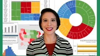

Learn how to create interactive Excel dashboards with pivot tables and automatic chart updates. Showcase your Excel skills and create visualizations for reports, dashboards, and KPIs. This course is perfect for beginners and professionals who want to leverage data as an analysis tool. Build business intelligence deliverables and expand your portfolio with real examples of your work. Gain confidence in Excel and become proficient in data visualization techniques. A structured, engaging, and useful course for anyone looking to enhance their Excel skills.
What you’ll learn
- Work with datasets to create an interactive Excel Dashboard with pivot tables, where charts and graphs are updated automatically in an easy to view display.
- Understand how to apply your knowledge of Microsoft Excel features for data visualizations
- Create your own portfolio piece to showcase your skills with Microsoft Excel
- Learn how to explain your visualizations, including reports, dashboards, and KPIs
In today’s modern world, individuals and corporations are exposed to data and need to know how to use it to their benefit. Data can provide answers to old problems or predictions of new situations. This course will provide the essential skills needed to successfully create data visualizations, simple and complex in nature. In Excel Data Visualization Techniques, we will walk you through common charting techniques to assemble reports, dashboards, and KPIs. Many of the skills necessary to graduate from Excel to enterprise tools including Microsoft Power BI Desktop and Microsoft Power BI Services as well as Tableau Desktop, Server, and Data Prep are covered in this hands-on, interactive class.
By the time you finish this course, you’ll learn to identify trends, navigate large data sets, and streamline data into visual representations in Excel Topics include:
Data Visualization Principles, including Reports, Dashboards, and KPIs
Tables and Heatmaps
Bar and Column Charts
Gantt Charts
Histogram and Pareto Charts
Box and Whisker Plot Charts
Tree maps and Sunburst
Line Charts (Time Series) & Sparkline
Area & Waterfall Charts
Scatter Plots & Regression
Bubble Charts
Geospatial Maps
Pivot Tables & Dashboards
At the conclusion of each unit, you’ll be able to practice these skills taught using an extended exercise along with various quizzes. When you finish this course, you will be able to build business intelligence deliverables that maximize data visualization.
Who this course is for:
- Beginners who want to work with large data sets in Excel.
- Professionals users looking to learn how to leverage data as an analysis tool.
- Learners who want to expand their portfolio and have a real example of their work to prospective employers.
- For learners who are seeking a well organized, structured, straight-to-the-point course.
- Learners who are tasked with making visualizations of data by creating visual representations like charts and graphs.
- Professionals looking to become more confident in Excel.
- Students who want a structured, engaging, fun and useful Excel course.
User Reviews
Be the first to review “Excel Data Visualization Techniques”
You must be logged in to post a review.





There are no reviews yet.